In our previous blogpost The Big Picture - Connecting Strategy to Architecture, we identified Technology Diagrams as an important artifact during Transformations.
A technology diagram is helpful in the following digital transformation scenarios:
- Mergers and acquisitions where digital products/services have overlapping or similar features
- Splitting a monolith to understand what component/services belong to specific business domains
- Explaining to Executives how different components interact and where technical debt exists
What is a Technology Diagram for Business Stakeholders?
Most Technology Diagrams are designed by Engineers for Engineers. Technology Diagrams for Business Stakeholders or non-Engineers are designed for the rest of the organization. The goal of these diagrams is to bridge the communication gap between 'The Business' and technology.
In Transformations, another goal is to show the current state and one or more future states. As such, diagrams need to be artistic enough to tell the right story.
To create an effective diagram for non-technical stakeholders, we use several techniques.
- Group in layers such as users, user interfaces, business logic, and data persistence
- Organize left to right to show processes or journeys
- Only use arrows or connecting lines to show data flow
- Use animation with more than a dozen objects on the diagram
- Consider printing on a large format printer - at least 11" x 17"
- Consider a hierarchical numbering scheme to tie the drawing to other artifacts
- Avoid technical terms as much as possible
- If you need acronyms, use a legend or reference key
- Use red/yellow/green colors to show health or risk
- Use different shades of 1 color to show relative differences
Let's look at examples of each of these techniques.
Grouping in Layers
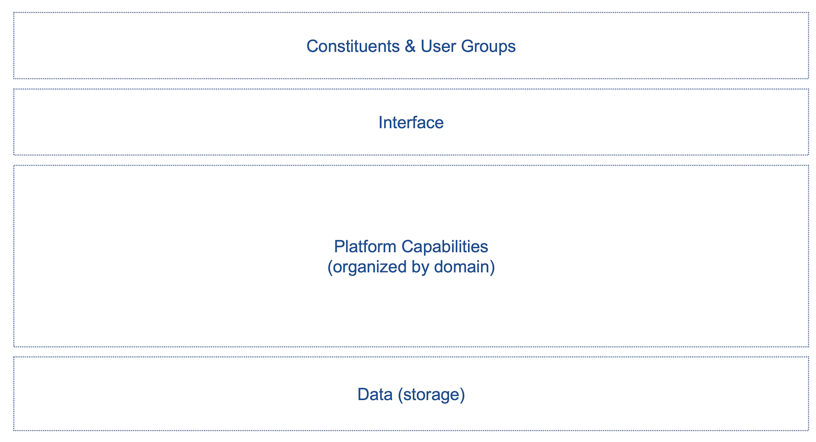
This technique is common among Engineers. Engineers think in layers. Yet, it may be a new concept for technical stakeholders. We like to see 4 layers - from top to bottom:
- user groups
- user interfaces
- modules or business logic components
- persistence stores (e.g. databases)
Most engineers only think of the last 3 layers - what they build and maintain. Business stakeholders can understand who uses a device or application. Engineers need to make the connection to the end customer or user. The following example is a common layout designed for a landscape screen or print:
The following example shows a simple eCommerce experience.
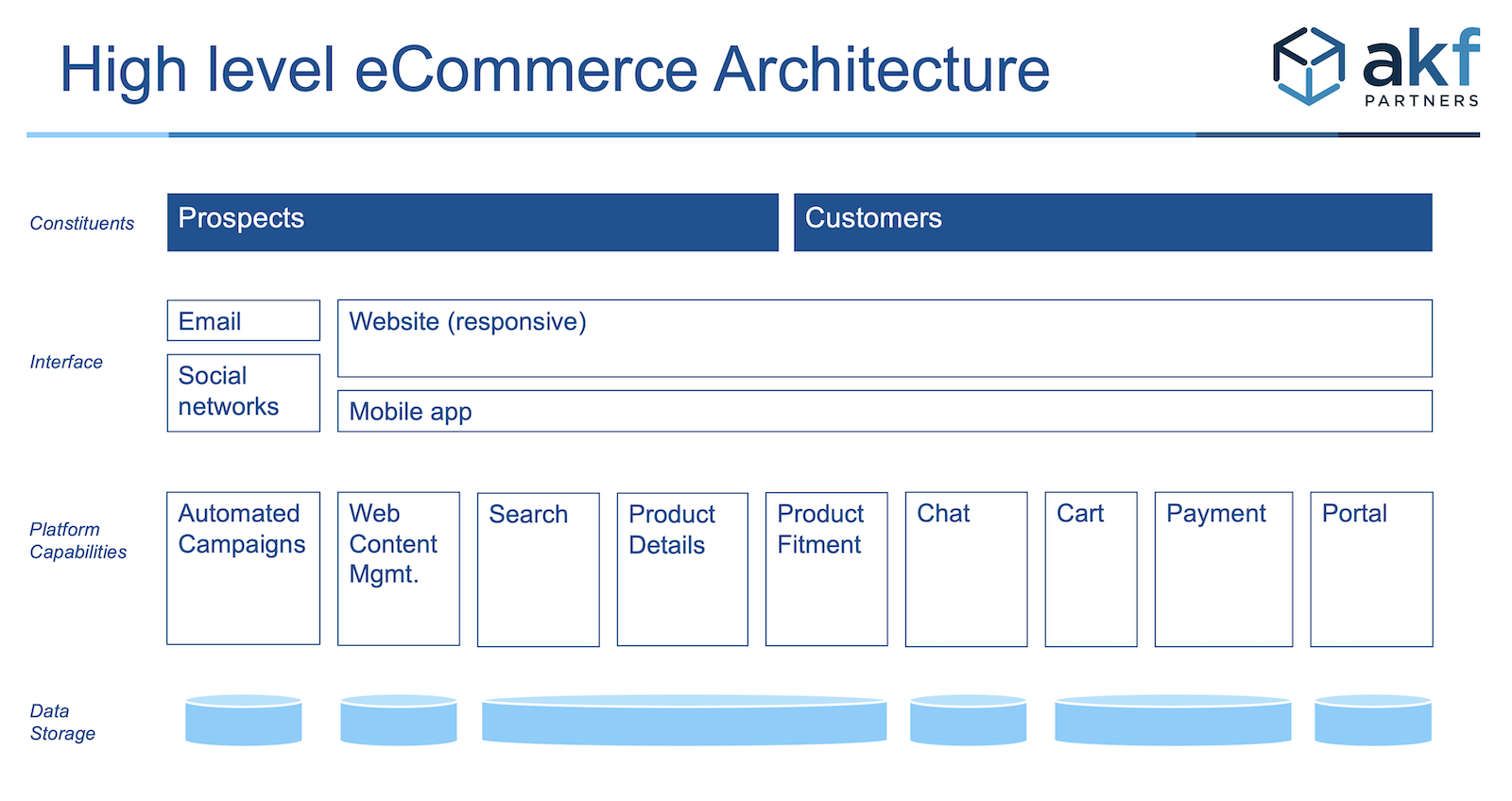
The audience can see several modules or domains in a typical eCommerce solution. The audience can see different types of buyers.
In this example, we have avoided using arrows. Arrows can distract from understanding different users and functionality.
Left to right processes or journeys
Many architectures are designed to support one or more processes or relationship journeys. Processes and processes are similar in that there is a general sequence of activities. Processes and journeys are different in that:
- Processes – have to be followed to get to an end state or conclusion. An example is a vendor getting paid.
- Relationship Journeys – participants can usually opt-out, and a good portion do not complete all desired steps. A common example is that a prospect may or may not become a paying customer.
The following example is a Procure to Pay Architecture. The categories listed below are from Gartner. This example is used to show how multiple platforms span multiple constituents.
Furthermore, each constituent may use one or more interfaces. This illustration is drawn to suggest which platforms share a common data store. The example below does not include arrows showing data flow. However, an architect may wish to show a 2nd version of the same drawing with arrows showing data flow.
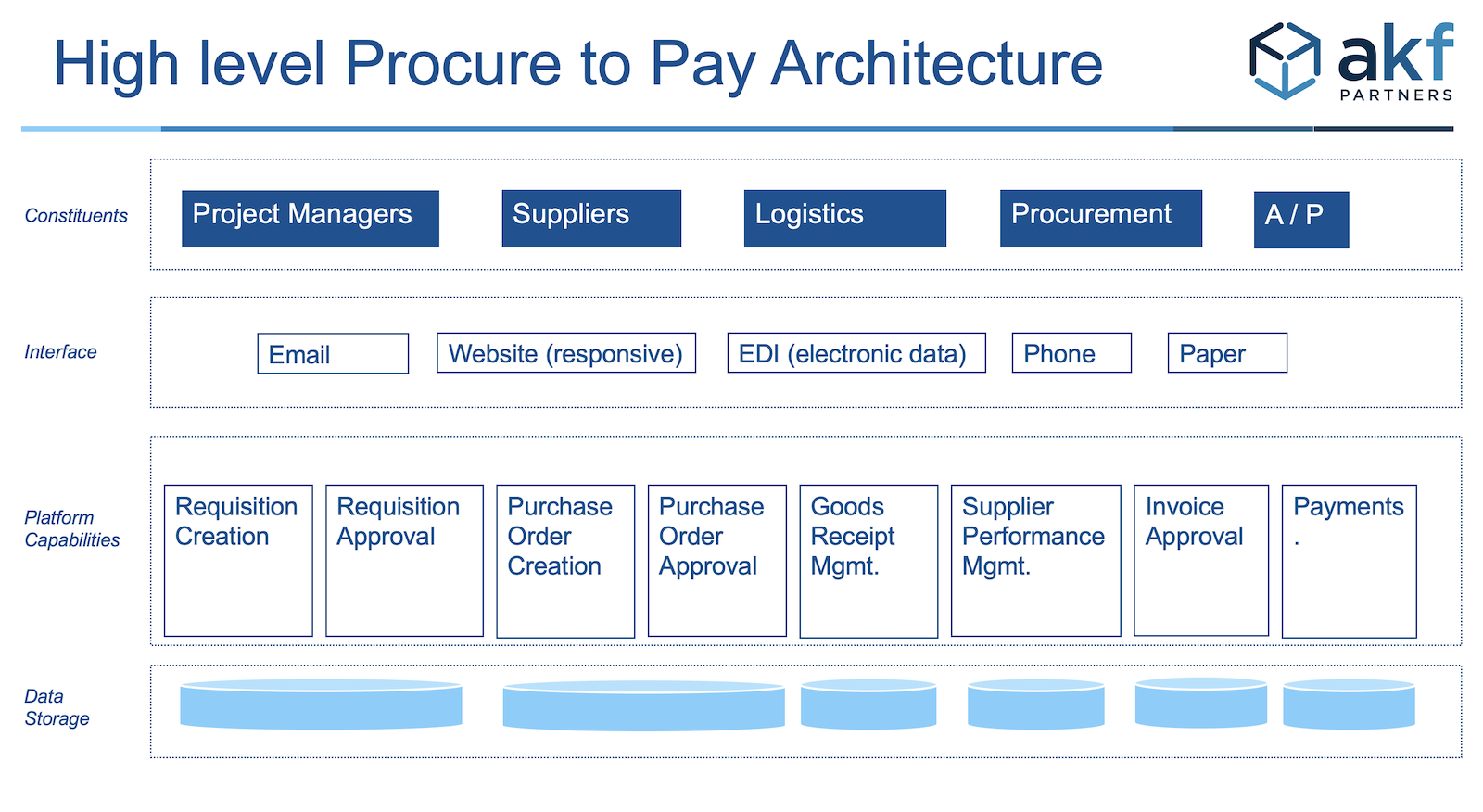
The general flow is left to right for platforms and constituent involvement. It is not an exact flow of any particular process. For example, a requisition (e.g. an RFQ) is needed before a PO can be managed by Procurement. Procurement must occur before payments are executed by Accounts Payable.
A relationship journey also tends to follow a sequence of events or stages. The stages are identified in terms of one side of a relationship. In the customer relationship example, a sales team may use these stages in terms of a pipeline and how a sales team is compensated:
- Prospecting
- Lead qualification
- Demonstration or meeting
- Proposal
- Negotiation and commitment
- Opportunity won
- Post-purchase
A marketing team may use different terms that describe the stages relationship from the prospect or customer’s perspective:
- Awareness
- Consideration
- Decision
- Retention
- Loyalty
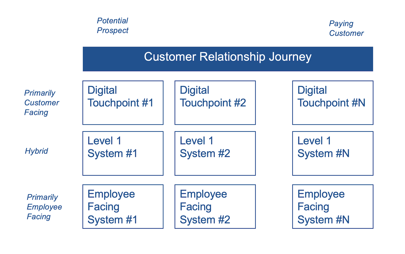
Whether your company uses sales or marketing terminology, you likely also have another dimension of how digital your touchpoints are with respect to your customers or prospects. In the high level diagram below, the top is customer facing and the bottom is employee facing. The journey is left to right from the prospect to loyal paying customer perspective.
The following example is a more detailed view of an eCommerce Architecture following the Customer Journey (left to right) and the primary user of each system (top layer is customer facing and bottom layer is employee facing).
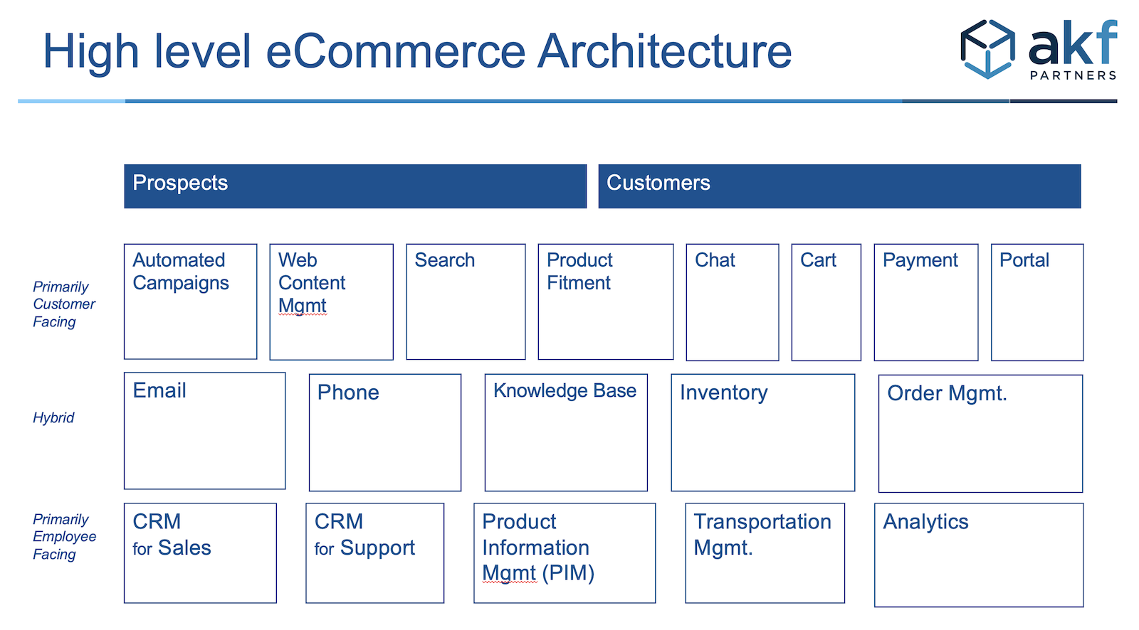
In the above example, we have illustrated over a dozen systems that span a handful of teams. All of these systems need to interact in order to convert prospects into long term customers.
In both the internal and external example, the flow of information is implied. Arrows may distract from the key message of the flow of information across teams and systems.
Using arrows and connecting lines
Diagrams with connecting lines are important in the following scenarios:
- Getting different teams to see what information is moving between teams or systems
- Identifying bottlenecks or pain points
Diagramming platforms such as Lucid have numerous examples of visualizations for showing how data and information flows. Some examples that are intended for non-technical audiences are:
- Data flow diagram of a reservation system
- Information flow between Salesforce Commerce Cloud and Service Cloud
- Data flow for manufacturing entity using Salesforce platforms
Identifying bottlenecks in a process or pain points typically requires arrows to show the order of steps and swimlanes to show different actors. Some examples include:
- HR onboarding process by team and by week
- Internal process controls by connection to different SAP Financial modules
Where possible, minimize the effort for the reader to understand different types of models that have their own visual language. For example, Business Process Management Notation (BPMN) has specific shapes and connectors. The high level flow can be understood by a reader not familiar with BPMN, but the details require translation. Models such as UML are too technical for non-technical users.
Using animation
When the diagrams get busy, animation and/or layers makes it easier for a presenter to pace the delivery. Animation also makes it easier for a reader to read in the correct order.
The following example is a high level customer relationship journey map for 2 Personas across 8 human and digital touchpoints. Persona A is a younger Persona that tends to use digital touchpoints. Persona B is an older Personas that tends to use human touchpoints.
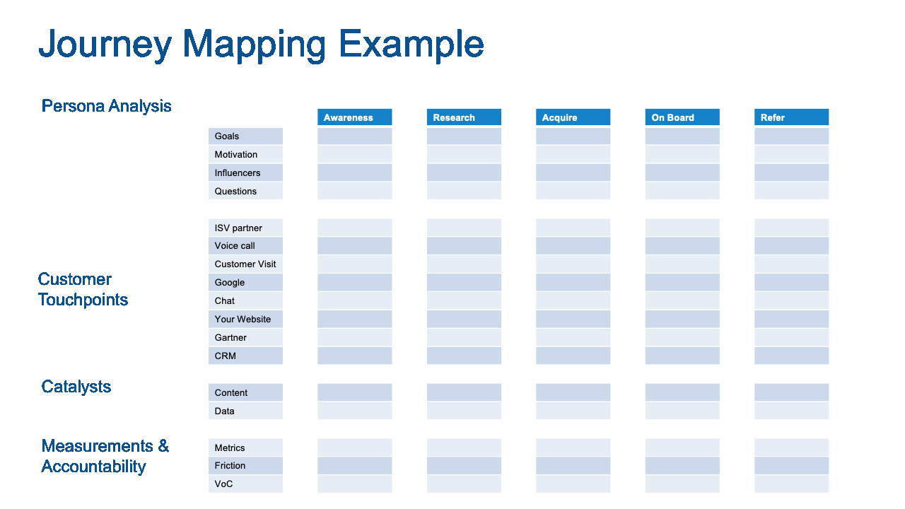
Animated diagrams are usually created with PowerPoint or Keynote. PowerPoint has the largest number of users. Keynote allows for larger canvases and more robust artwork. The learning curve switching from PowerPoint to Keynote is non-trivial. Staying within PowerPoint focuses the diagram to the most important content.
Printing on Large Format Paper
PowerPoint slides are usually styled for 3 different scenarios:
- Large live audience. These slides have more artwork than text. The text is large font - typically 18 pt or larger. Technical diagrams are not appropriate for this scenario.
- Small live audience. These slides have more text than artwork. Charts are common. Many slides are not presented live, but read before or after a meeting.
- Large report. These slides are more like small books or booklets. The text is too dense for a large audience. The report is delivered first. Then the author walks through new or contentious topics.
Technical diagrams are mix of #2 and #3. The diagrams will likely be dense. Non technical diagrams are often created in PowerPoint for productivity reasons. PowerPoint is also common because it the most used graphic program in a company.
Diagrams usually need to be printed. Don't restrict yourself to standard 8.5" x 11" paper. Use at least 11" x 17". This allows the author to use smaller text and arrows.
For very large drawings, use a plotter. Unrolling a diagram in front of an audience sends the signal than architect is about to speak. Printing on paper also forces the author to make the diagram as polished as possible.
Using a hierarchical numbering scheme
Hierarchal numbering schemes are common in large IT organizations. These numbering schemes are not common in digital product companies.
There are several reasons why hierarchical numbering is common in large IT organizations:
- Large companies have made several acquisitions
- Each acquisition has overlapping or redundant capabilities
- Industry standard process classification frameworks exist
- The numbering scheme is the primary key
- The primary key makes it easy to cross reference an element on a drawing to another artifact such as another diagram, roadmap, or budget
The following example shows a list of capabilities for the Sales, Marketing, and Strategy teams. The numbering scheme comes from the open standard APQC Process Classification Framework
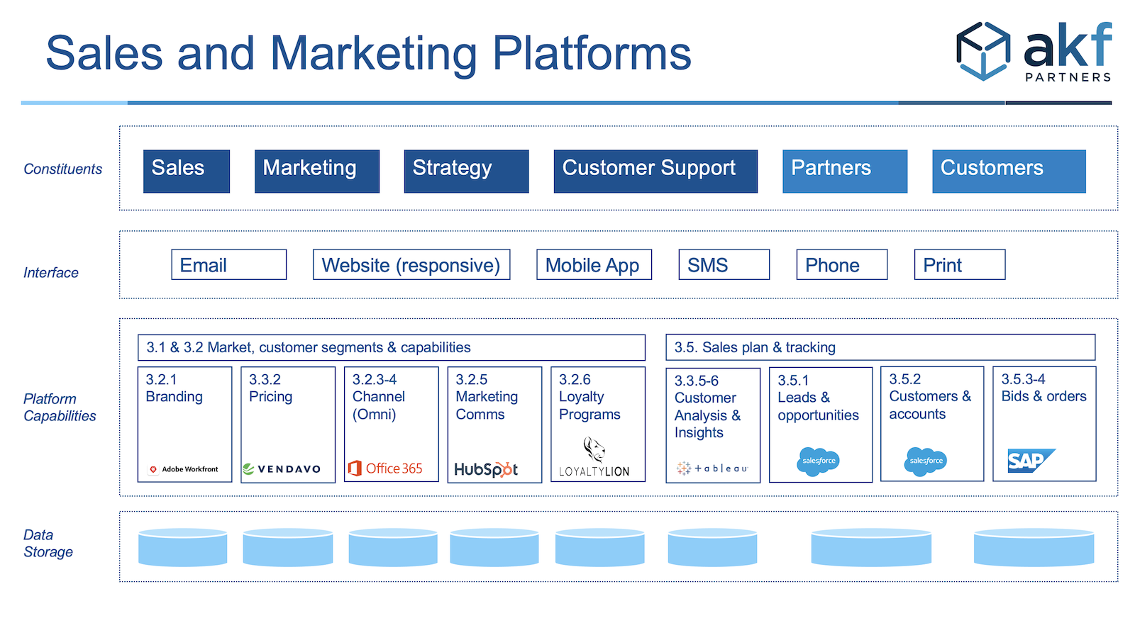
SaaS companies should consider a numbering scheme to connect a diagram to a large feature matrix. Recall that a feature matrix is useful to show what features/capabilities are important to different personas. In these situations, the numbering scheme is arbitrary. Industry standard classification schemes typically do not apply.
Technical Terms and Acronyms
Avoid technical terms wherever possible. These diagrams are for non-technical audiences. If the audience doesn't understand a technical term, the reader will get confused or ignore the content.
Acronyms are often needed. Acronyms are usually known by long time employees. We still recommend using a Key or Legend for acronyms. The audience is large. The likelihood that everyone in the intended audience knows all acronyms is small.
Using Colors and Heat Maps
Different colors and different shades of a single color add another dimension to the diagram. The general rule is to pick only one of these options:
- Use Red/Yellow/Green to show risk or health.
- Use different primary colors to show different business domains
- Use different shades of 1 color to show relative size or quantity - not related to risk or health
How to Create these Diagrams
These diagrams should look like they took a significant effort to create. However, you should create these as quickly as possible. The knowledge to create these drawings is in the noggins of several technical and non-technical experts.
These are the primary methods to capture the information needed to create these diagrams:
- Individual interviews - usually the least efficient method
- Group interview - using a list of systems, ask the group what connects to what, what flows, who uses the system, what is working, and what i not working
- Event storm - usually reserved for Domain Driven Design, event storms captures a great deal of information very quickly. The event storm evolves to a logical left to right flow.
When to Create these Diagrams
We described the Transformation scenarios at the beginning of this article. We are also proponents of Agile. Agile does not eliminate technical diagrams - but favors working software over documentation. Agile does find documentation important. As such, consider creating these diagrams in these scenarios:
- Onboarding a Product Manager. Product Managers are often business stakeholders but lack technical skills.
- Splitting or merging a service. After an event storm for a Domain Driven Design session, additional diagrams may be needed. More technical diagrams may be needed. Use the non-technical aspects listed above to stay focused on business outcomes vs engineering dogma.
- Getting different teams on the same page. When an interface is needed, a diagram may be needed to see actors, information flow, services, etc.
How AKF can help
If you need help creating these diagrams, we can:
- teach you how to create them in a short amount of time.
- help you avoid wasting hours on the artistic or engineering side.
- help you identify the risks in the current state.
- help you model the future state focused on business outcomes.
Contact us at AKF.